Using Act Metrics
Act metrics is where you see how your nudge program is performing. Who's receiving nudges, who's viewing and reacting to them, which behaviors are getting sent most, and whether nudges are going out on schedule.
You'll find it under Act in the top navigation of the Perceptyx platform if you have an Activate subscription. This article walks through each section and what the numbers actually mean.
A quick refresher on nudges
If you're new to Activate, nudges are short, personalized messages that go to your employees inside the Perceptyx platform and in tools like Slack, Microsoft Teams, and email. Each one suggests a small, specific behavior to try, based on things like the employee's action plan or focus areas they picked for themselves.
Everything on this page measures how people interact with those nudges.
Tip: hover the info icon
Every item on the Act Metrics dashboard has a small info icon next to its label. Hover it and you'll get the exact definition of that metric. If you're ever unsure what you're looking at, start there. It's faster than guessing, and the definitions are more precise than most people expect.
Filtering

Three filters sit at the top of the page, and they apply to everything below them:
- Date Range. Defaults to Previous 3 months. Click it to change the period, or click the X to clear it.
- Demographic. Which demographic field you want to break the data out by.
- Value. Which specific values within that field you want to see.
Demographic and Value work together. Demographic picks the category, Value narrows it to the groups you care about. Both open a searchable checkbox list with a Select all option, so you can pick several at once. After you make your selections, click Add filter to apply them.
One thing to know: the Demographic list shows your field names the way they exist in your data file, so you'll see things like age_band and acquisition_description rather than tidied-up labels. If you're not sure which field is which, your Perceptyx team can help you map them.
Nudge Delivery Status

This section answers a simple question: are nudges actually going out?
That's a fair thing to wonder about. If you're sending nudges to thousands of people, you can't look over thousands of shoulders to check. So this section tells you:
- Last nudge sent. The date the most recent nudge went out.
- Next scheduled nudge. The date the next one is scheduled.
- Number of sent nudges. How many nudges went out during the period and group you've selected.
If the last-sent date looks older than you'd expect, or the next scheduled date is empty, that's worth raising with your Perceptyx team.
Nudge Engagement Summary

This is the health check for your program.
- Users eligible for nudges. How many people have been given access to nudges.
- Percentage of users who viewed a nudge. Of the people who received a nudge, how many saw one. This counts every channel, so a view in Slack counts the same as a view in the platform.
- Percentage of users who reacted to a nudge. Of the people who received a nudge, how many clicked "yes," "no," or "I already do this" on one.
Worth noticing:
Both percentages are calculated out of the people who received a nudge, not out of everyone eligible. Those two groups can be different, and the eligible-users number is there partly so you can see the gap.
Both percentages are color-coded so you can tell at a glance whether you're in a healthy range. A very low number usually points to something technical rather than something cultural. A number that's low but not unusually low is more often a sign the program needs more internal communication and manager support behind it.
Reaction rates run lower than view rates, and that's expected. Viewing a nudge is passive. Reacting takes a click.
Nudge Details
Two charts live here:
Nudge view rate over time
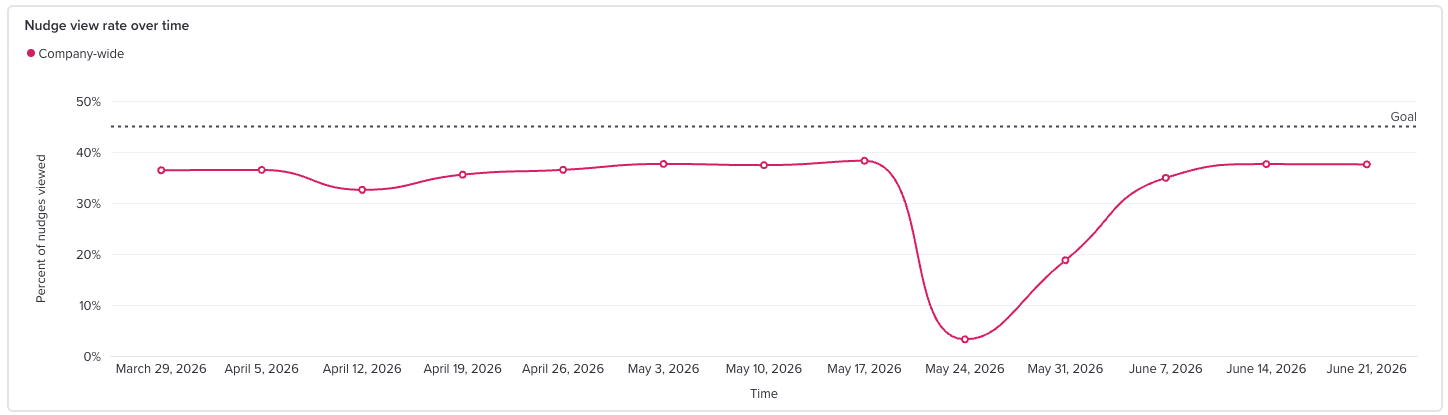
This one trends view rate across the period you've selected. Note that it measures something slightly different from the summary tile above: this is the number of nudges viewed out of the number of nudges sent, rather than the number of people.
- By default you get a single line labeled Company-wide.
- Pick a Demographic and some Values and the chart splits into one line per group, so you can compare them side by side. Select eight departments and you'll get eight lines. Click any item in the legend to hide or show that line.
- The dotted line represents the target view-rate benchmark of 45%. Groups above this threshold demonstrate comparatively strong nudge visibility, while groups below it may benefit from a closer look at awareness, communication, and manager support
Top nudge behaviors
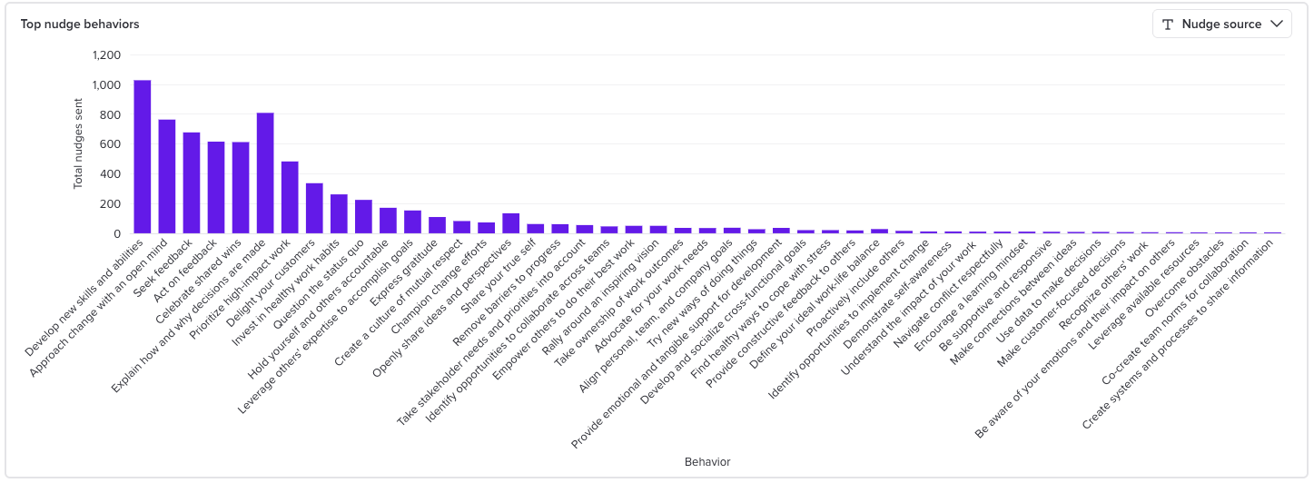
This shows how many nudges were sent for each behavior, so you can see what your organization is actually being nudged about. Behaviors are things like "Develop new skills and abilities" or "Prioritize high-impact work." They're sorted highest to lowest, so the leftmost bars are your most-sent behaviors.
Use the Nudge source filter in the top right corner of the chart to narrow by where the nudges came from:
- Personal Focus Area, meaning topics employees chose for themselves
- Action Plan, meaning nudges tied to action plans built from survey results
- Campaigns
You can select more than one, or use Select all.
Learning Link Engagement
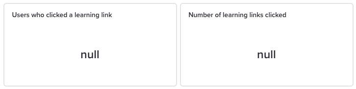
These only populate if your organization has learning links configured. If you don't have them set up, you'll see null rather than a zero. That's not an error, it just means there's nothing to count.
For more on enabling Learning Links go check that out at this link.
Nudge personalization
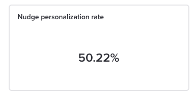
Nudge personalization rate is the percentage of employees who have gone through the personalization flow in Activate, where they share a bit about their job and pick personal focus areas.
More personalization generally means more relevant nudges, so this is a useful number to check if engagement is softer than you'd like.
Activity Persona Breakdown (Legacy Metrics)
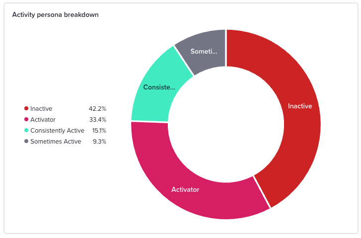
This donut chart sorts employees into four groups based on how much they interact with nudges: Inactive, Sometimes Active, Consistently Active, and Activator.
As the heading says, these are legacy metrics. They will eventually be removed from the page and are being left in place for now as a transition period for those of you who are used to thinking in terms of those metrics, so you can compare them to the new metrics.
If you've been reporting on personas internally, switch to the Nudge Engagement Summary and view rate metrics instead.
Activate chat engagement

If your organization has AI coaching enabled, this section at the bottom of the page shows coaching session activity:
- Employees who chatted with Activate
- Conversations
Note that this section covers the last 90 days and doesn't follow the Date Range filter at the top of the page.
Privacy Note: groups of fewer than five
Every number on this page respects a minimum group size of five people. Filter down to a group with fewer than five employees and no data will display for it.
You'll see this stated in the info tooltip on every metric. It's there to protect individual employees from being identifiable in the data.
Common questions
What counts as a view? A nudge being displayed to the employee, in any channel. Slack, Teams, email, and the platform all count the same way.
What counts as a reaction? Clicking "yes," "no," or "I already do this" on a nudge. All three count as a reaction. Reacting "no" still counts, because the point of the metric is engagement, not agreement.
Why is my view rate below the Goal line? Usually it means people either aren't seeing nudges where they work or don't yet know what nudges are. Manager communication tends to move this number more than anything else. If your rate is very low across the board, get in touch with your Perceptyx team, because that can point to a delivery or configuration issue.
Why can't I see one of my departments? Most likely it has fewer than five people in it, so it's suppressed for privacy.
Why do my learning link numbers say null? There are a number of possibilities why you might see this:
- Your organization doesn't have learning links configured.
- Nobody in the selected group has clicked links
- The selected group is below the privacy threshold of 5
Why is the view rate chart a different number from the percentage in the summary? They measure different things. The summary counts people. The chart counts nudges. A single person can view several nudges, so the two won't match.
Was this article helpful?
That’s Great!
Thank you for your feedback
Sorry! We couldn't be helpful
Thank you for your feedback
Feedback sent
We appreciate your effort and will try to fix the article