Analyze
AI Insights: what each card shows, what it needs to appear, and how to read it.
If you have ever opened a survey report, looked at a wall of percentages, and thought “okay, but what does this actually mean?”, AI Insights is built for exactly that moment.
AI Insights Dashboard, is an exciting new capability within our Narrative Analysis Agent. A dashboard within your report that expands our generative AI capabilities beyond comments into quantitative data, bringing more of the employee listening story together and helping customers move from data to insight to action faster. AI Insights help turn a wall of survey metrics into a clear, easy-to-understand story. It automatically surfaces what’s happening, why it matters, and where they may want to focus, grounded in Perceptyx’s analytical approach.
Your reports already give you the numbers. AI Insights reads those same numbers and writes up what it sees: what your organization does well, where it falls short, and which areas are worth acting on first. Every piece of narrative helps support the figures it came from, and the cards link back to the full reports so you can check the detail yourself.
The agent does not pick the numbers. Every score, threshold, and ranking on the page is chosen by fixed rules and pulled from your existing reports. The AI writes the words on top of that. It cannot add an item, remove one, or invent a figure. Read more about the logic behind the intelligence here.
This article walks through
Before you start
AI Insights only appears when several things are true. If you cannot find it, this list is almost always why.
Your organization has to opt in to a Narrative Analysis Agent or Comment Copilot subscription. AI Insights is an enhancement to our existing Narrative Analysis Agent product. AI Insights is not available on its own and it is available to customers who already have either one of those two AI features enabled.
Your survey has to be closed. AI Insights works on closed point-in-time surveys only. If you open it on a survey that is still collecting responses, you will not be able to view insights until the survey closes. Lifecycle surveys, cross-survey views, and passive data are not yet available.
Your survey needs enough responses. Each section has its own minimum, and the baseline is five completed responses by default, though this is configurable per survey. Some sections need considerably more. This is the same confidentiality logic your reports already use, and AI Insights does not get to bend it.
You need admin or creator access without view restrictions. Access is limited to admins and creators who can see all survey responses. If your reporting access is scoped to a department, region, or any other subset, you will not see the menu item.
Narrative Analysis Agent and Comment Copilot use generative AI powered by OpenAI, including the AI-generated narratives within AI Insights. For details about our approach to generative AI, please see the Perceptyx Perspective on Artificial Intelligence, Machine Learning, Natural Language Processing, and Generative AI article. Please note that neither Perceptyx nor OpenAI train on customer data.
How to open AI Insights
AI Insights lives inside Advanced Reporting, alongside your detailed survey reports.
- Go to Analyze in the top navigation bar.
- Open the report for the closed survey you want to look at.
- In the left navigation panel, find AI Insights. It sits near the top with a small blue orb icon, grouped with Narrative Analysis Agent or Comment Copilot.
- Click it.
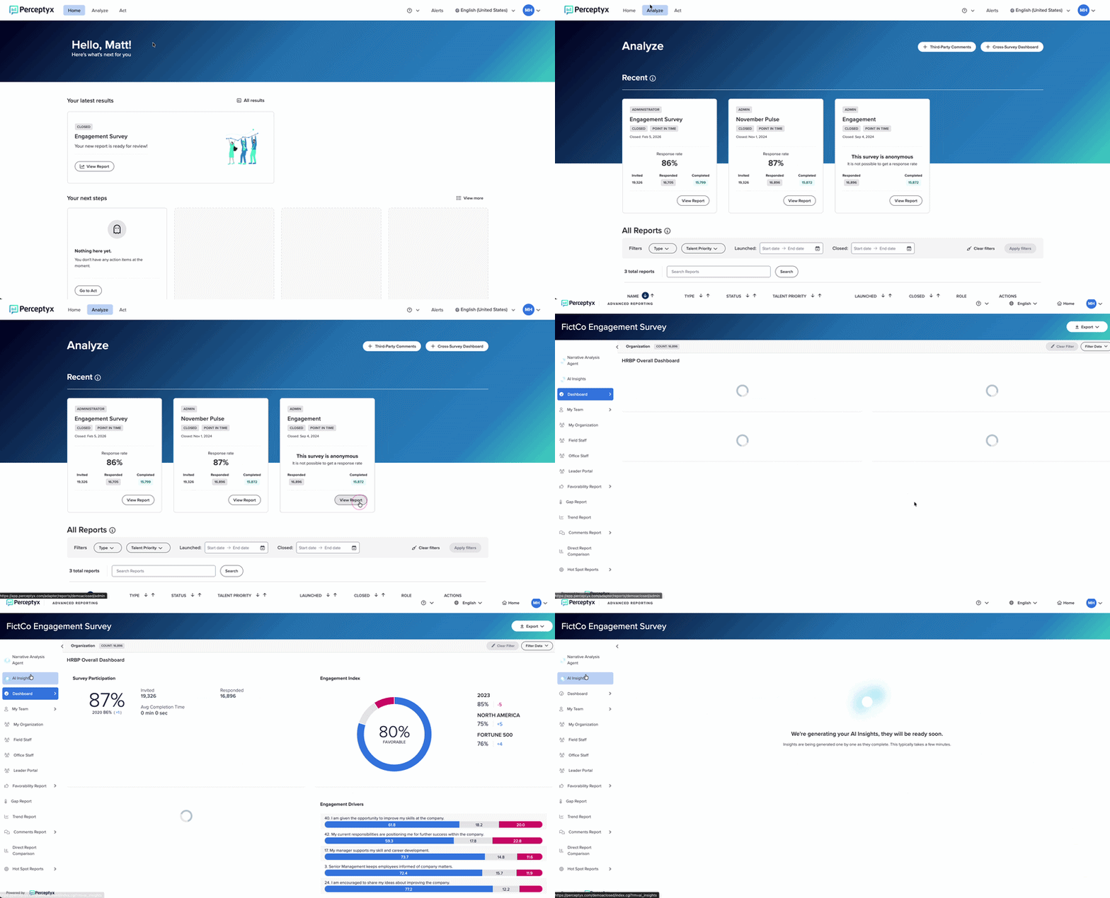
AI Insights opens as a full screen view, the same way Comment Copilot does. You return to your report the same way you came in. If you use the platform in another language, the menu item is translated along with the rest of the interface.
One important limitation
Insights are generated on your survey's overall results only. There is no way to get an AI summary for a single department, a filtered view, or any subset of your results. If you apply filters in Advanced Reporting, the AI Insights page does not reflect them.
Filtered and team level insights are a future consideration, not a current feature. For now, AI Insights answers “what is the story for the whole organization,” and the reports behind it are where you go to slice things up.
What happens when the page loads
The first time you open AI Insights for a survey, the cards are being written from scratch. Expect a few minutes. Each card checks in roughly every 10 seconds while it builds, and each one gives up after about two minutes if something has gone wrong.
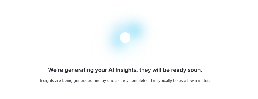
Once a card finishes, the result is stored. Come back later and it loads immediately rather than rebuilding.
Cards build independently and in no fixed order, with one exception: the executive summary waits for the others to finish, because it is written from their output. So the summary at the top is usually the last thing to appear. That is expected, not a bug.
If a section does not apply to your survey, it simply will not be there. There is no greyed out placeholder and no explanation. A missing card almost always means your survey did not meet that section's requirements, not that something broke. The requirements for each are listed below.
A card that actually fails to build looks different: you get a visible error state with a Retry button.
What each section covers
Every card carries a short AI Insight preview that is cut off after a few lines. Click the arrow at its right edge to open the full narrative in a panel that slides out from the right of the screen. That panel has its own Copy button, and it is where you read the complete write-up for any card.
Here is the whole page at a glance, then the detail on each one.
| Section | What it needs |
|---|---|
| Executive Summary | Strengths and Opportunities to generate first |
| Response Rate | A closed survey |
| Engagement Index | A configured outcome measure |
| Strengths and Opportunities | At least one rating question, five or more responses |
| Recommended Focus Areas | A configured driver of engagement, 25 or more responses |
| Comment Insights | Comment analysis enabled for the survey |
Note: if your organization configures its own surveys, some cards may show less detail than described below.
Executive Summary
This is the closest thing to “just tell me what happened.”
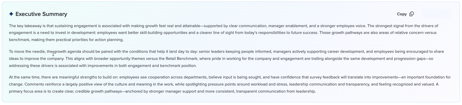
It covers the overall takeaway, what drives engagement, what changed, and the single most important area to focus on. If you only have two minutes, read this and stop.
Two things are worth knowing about how it is built. First, it is written last, from the finished output of the other sections rather than from raw survey data. That means it never tells you anything the cards below it are not also telling you, which is deliberate. Second, it needs Strengths and Opportunities to have generated successfully. Everything else gets folded in when available and quietly left out when not.
This card has a Copy button in its header, which lifts the whole summary to your clipboard for pasting into a deck or an email.
Response Rate
Participation for the survey at a glance, shown as a single percentage.
This is context rather than insight. A finding based on 42 percent participation deserves a different amount of confidence than the same finding at 91 percent, and having that number in your eyeline while you read the rest of the page is the point.

Engagement Index
The score for your survey's outcome measure, which for most organizations is engagement. If your survey is configured around a different outcome measure, this reflects that instead.

Strengths and Opportunities
These sit side by side and are mirror images of each other, generated independently. Both need the same things: a closed survey with at least one rating scale question that meets the minimum reporting threshold.
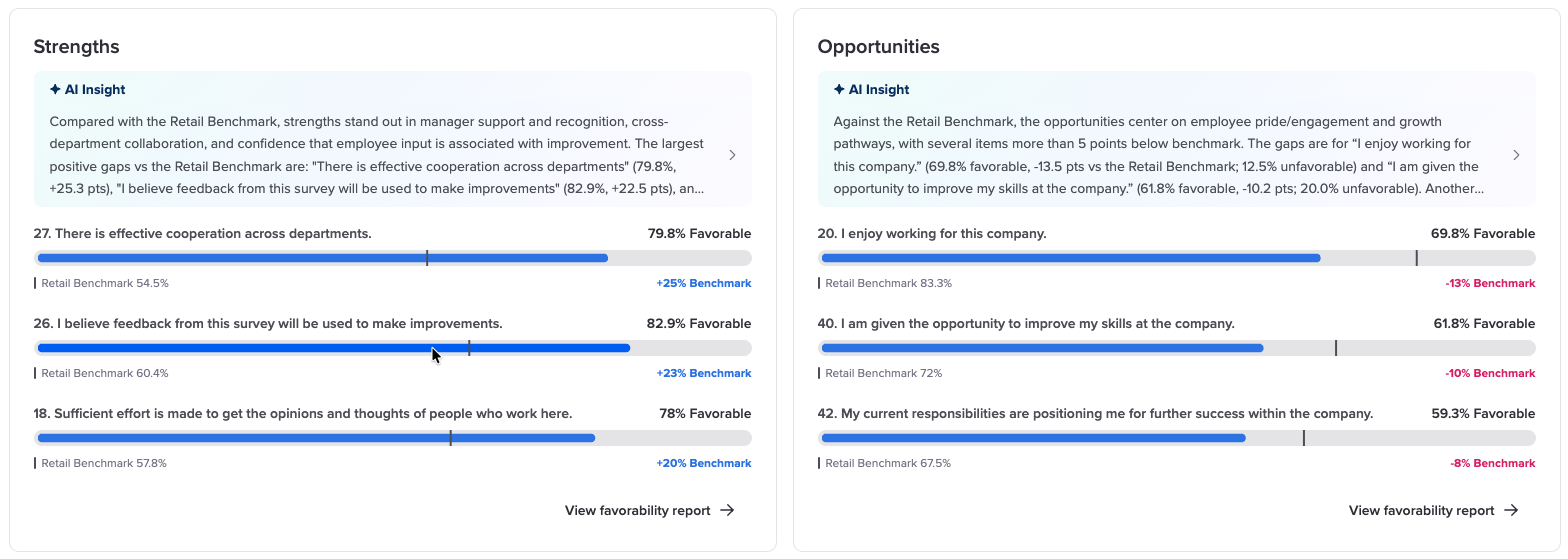
Strengths shows up to three top performing questions. Opportunities shows up to three of the lowest performing. Each row gives you the question, its favorability score exactly as it appears in your Favorability Report, and how far it sits from your benchmark rounded to a whole number.
How the items get picked depends on whether you have a usable benchmark:
- With a benchmark, and a gap of five or more points. Every question that far above or below the benchmark qualifies, biggest gap first. These are framed as benchmark strengths or benchmark opportunities.
- With a benchmark, but no gap that large. You get the three biggest gaps instead, framed as relative strengths or relative opportunities. The wording matters here: relative means “compared to the rest of your own results,” not “compared to other companies.”
- Without a usable benchmark. You get your five highest or five lowest scoring questions on raw favorability, with no comparison involved.
Either way, the card face displays the first three items.
One quiet behavior is worth knowing: if a benchmark is configured but cannot be matched to your report, the card falls back to the top or bottom five without telling you. So if a card says “relative” when you expected a benchmark comparison, that is worth a ticket.
If nothing at all sits above your benchmark, the Strengths half still appears with a narrative saying so rather than vanishing. The same applies in reverse for Opportunities.
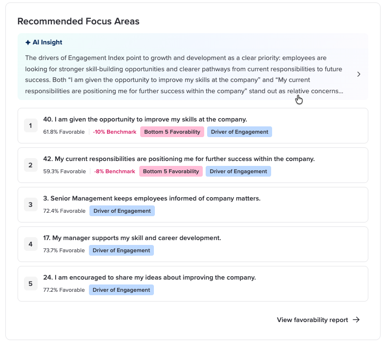
Recommended Focus Areas
This is the “so what do I actually do” section, and it is worth slowing down on.
You get a numbered list of up to five questions, each with its favorability score, its gap versus benchmark, and badges. Common badges are Driver of Engagement, Top 5 Favorability, and Bottom 5 Favorability, plus a trend badge when a score moved significantly. The narrative runs up to two short paragraphs and groups the items into themes.
The important thing here is that these items are not chosen by the AI, and they are not just your lowest scores. They come from the same Priority Focus Areas logic your reports already use, which weighs how strongly each item connects to your outcome measure. The number next to each item is its position in that priority order.
The practical difference from Opportunities: Opportunities tells you where you scored poorly. Recommended Focus Areas tells you where improving would matter most. Those are often not the same list, and where they overlap, that is a strong signal.
This section needs more than the others to appear:
- A driver of engagement outcome has to be configured for the survey
- The drivers feature cannot be disabled for the survey
- You need at least 25 completed responses, by default
The badges are stricter than what you see in Advanced Reporting. A benchmark badge only shows when the gap is five points or more, and a trend badge only when the movement is both statistically significant and at least three points. So an item can appear on this card with no badges at all while your report still flags it. The item list itself matches your unfiltered Focus Areas.
Comment Insights
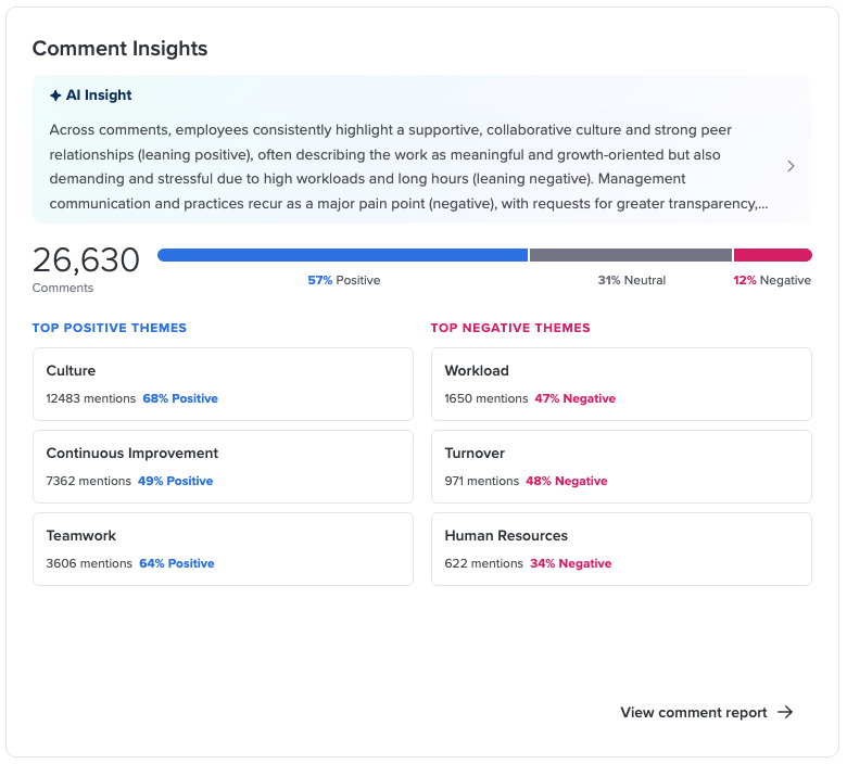
Everything above comes from rating scale questions. This section covers what people wrote in their own words.
You get the total number of comments, a bar showing the split between positive, neutral, and negative sentiment, your top themes, and a one paragraph narrative about what employees are saying.
Themes are split into two columns, Top Positive Themes and Top Negative Themes, with up to three in each. Each one shows the theme name, how many comments mentioned it, and the share of those mentions that leaned that way. A theme needs at least three mentions to appear at all. A theme mentioned equally often in both directions lands in neither column, which is worth knowing if you are hunting for something you expected to see.
Two honest caveats on this one:
- The comment count can differ from your Comments Report. This card counts the comments the sentiment model classified. The Comments Report counts on a different basis. Neither is wrong, they measure slightly different things.
- Raw comments are never sent to this card's AI step. The narrative is written from the per question comment summaries that were already generated, so it is a summary of summaries. That is good for privacy, and it does mean the narrative sits one step back from what people literally wrote.
To appear, this section needs the survey to meet the minimum reporting threshold and comment analysis to be enabled for it.
The honest caveats
There is a notice at the bottom of the page, and it is worth reading rather than scrolling past:
AI Insights are intended to assist, not replace, human review or professional advice. We recommend reviewing any AI output for accuracy and suitability before use. Perceptyx and OpenAI do not use customer data to train models. Minimum threshold requirements are always respected.
A few things to add.
The AI does not have your context. It can see that scores on an item dropped. It cannot see that you restructured that team in March, or that a competitor opened an office down the street. You know things the model does not, and your read on why something moved is more reliable than its guess.
Check anything before you put it in front of leadership. The links are right there. If you plan to quote a number in a board deck, click through and confirm it. That is good practice with any report and it applies here too.
Insights are a starting point, not a verdict. The best use of this page is to decide what to look into next, and what to bring to a conversation with the people whose results you are reading.
If something looks wrong
| What you are seeing | What to do |
|---|---|
| The AI Insights menu is not there | Work back through “Before you start.” Most often it is the survey still being open, your access being scoped to a subset of the data, or your organization not being opted in to the proper agents yet. |
| A message says insights need a closed survey | That is exactly what it means. Close the survey and come back. |
| I reopened a closed survey and my summary is gone | That is expected. Reopening clears the existing summary. It can be generated again once the survey closes. |
| A section is missing but the others are fine | Usually correct behavior rather than a bug. Recommended Focus Areas needs a configured driver and 25 or more responses. Comment Insights needs comment analysis enabled. Cards that do not qualify are hidden without explanation, so the requirements table above is the fastest way to work out which one applies. |
| A card shows an error with a Retry button | Click Retry. That is a build that failed rather than a section that does not apply. |
| A number does not match the report | Click through and trust the report. The one known exception is the comment count in Comment Insights, which counts differently from the Comments Report by design. For anything else, submit a ticket with the survey name and which card you saw it on. |
Related: To learn more about the science behind AI Insights, see AI Insights: A More Consistent Way to Understand Survey Results.
Where to get help
Click the question mark icon in the platform navigation bar to access our knowledge base, or submit a support ticket and our Customer Care team will take it from there.
Where to go next
Read more about our Narrative Analysis Agent.
Was this article helpful?
That’s Great!
Thank you for your feedback
Sorry! We couldn't be helpful
Thank you for your feedback
Feedback sent
We appreciate your effort and will try to fix the article